Equation
Reframing an established lighting design studio through a distinctive visual identity built around light, precision and progress.
Established in 1986, GIA Equation has evolved from an independent UK lighting design practice into an international studio working across a diverse portfolio of projects. To reflect this evolution, Sybarite developed a new visual identity that brings greater clarity and contemporary relevance to the brand while retaining the confidence and expertise built over four decades.
- Key Info
-
- Location
- London, UK
- Client
- Equation Lighting Design
- Services
- Branding, Visual Identity, Logo Design, Brand System, Graphic Design
- Year
- 2019
- Location
- London, UK
- Client
- Equation Lighting Design
- Services
- Branding, Visual Identity, Logo Design, Brand System, Graphic Design
- Year
- 2019
An Identity for the Next Chapter
The rebrand was conceived to express Equation as it exists today: established yet forward-looking, technically rigorous yet creative.
Rather than departing from the studio’s heritage, Sybarite sought to distil its character into a more focused visual language. The resulting brand identity balances modernity with longevity, creating a system capable of supporting the practice as it continues to evolve across markets, disciplines and platforms.
The Q
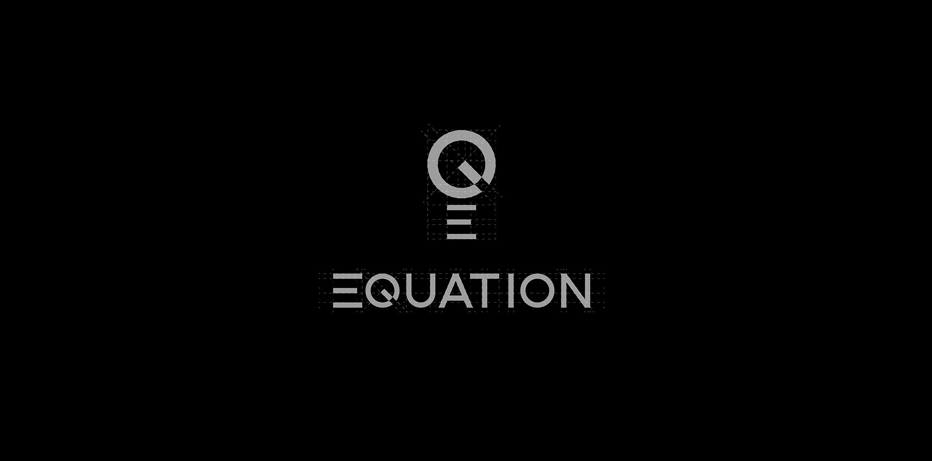
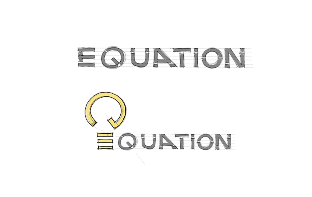
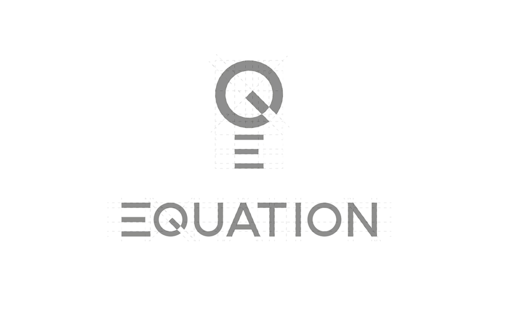
At the centre of the identity is a new monogram derived from the letter Q. Its geometry subtly references the form of a light bulb, connecting the mark directly to Equation’s specialism without relying on literal representation. Reduced to a singular graphic gesture, the symbol gives the studio a distinctive shorthand that can operate independently from the full wordmark.
This relationship between letterform and light creates an identity rooted in what Equation does while remaining abstract enough to extend beyond any single project, sector or application.
From Identity to Working System
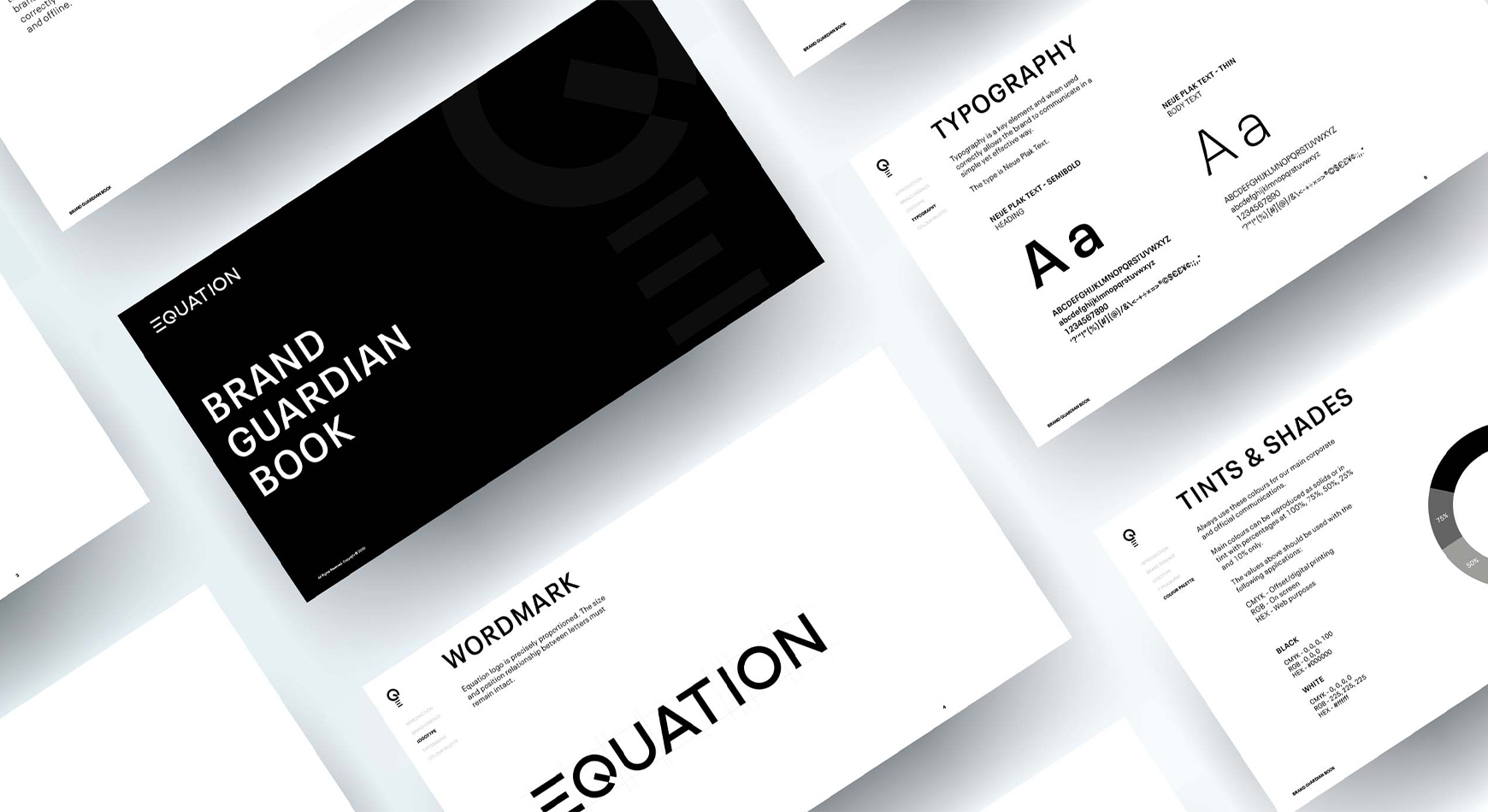
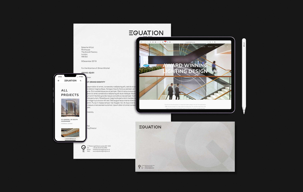
With no physical product range, Equation’s identity needed to work consistently across its everyday communications. Sybarite established a clear relationship between the wordmark and Q monogram across reports, presentations, correspondence and digital communications, creating a coherent system of scale, hierarchy and positioning.
Designed for flexibility, the simplicity of the Q monogram gives Equation a recognisable presence while creating continuity across physical and digital touchpoints. The result is a consistent identity that adapts naturally across platforms.
CONCLUSION
Equation’s new brand identity translates four decades of lighting design experience into a concise and adaptable visual language. Centred on a single graphic idea inspired by light and supported by a practical system for everyday application, the rebrand gives the studio a clearer contemporary expression while providing a framework designed to evolve with the practice.