SKP Branding
A distinctive brand identity built around a subliminal design language that evolves across place, scale and experience.
During the competition-winning transformation of SKP Beijing, Sybarite developed not only a new architectural vision for the department store, but a comprehensive brand identity that continues to define one of China’s leading luxury retail operators.
Spanning logo design, wayfinding, graphics, packaging, colour strategy and architectural language, the rebrand established a cohesive framework through which every customer interaction became distinctly SKP.
- Key Info
-
- Location
- China
- Client
- SKP
- Services
- Branding, Brand Positioning, Visual Identity, Wayfinding, Signage, Packaging, Graphic Design, Architectural Brand Language
- Year
- 2016
- Photography
- Edmon Leong, Kristen Pelou, Nick Kuratnik, Marco Zanta
- Testimonials
-
The collaboration with Sybarite has been very important, not only in terms of consistency of the brand application throughout our locations but also in terms of evolving the SKP designs in the right way. This evolution never stops. For example, just because SKP Beijing, SKP Xi’an and SKP-S are now all open and trading there is still a continuous on going push for newness and departments change all the time”.
Lorenzo Grazzini - Deputy Director, SKP Store Planning and Design
- Location
- China
- Client
- SKP
- Services
- Branding, Brand Positioning, Visual Identity, Wayfinding, Signage, Packaging, Graphic Design, Architectural Brand Language
- Year
- 2016
- Photography
- Edmon Leong, Kristen Pelou, Nick Kuratnik, Marco Zanta
The collaboration with Sybarite has been very important, not only in terms of consistency of the brand application throughout our locations but also in terms of evolving the SKP designs in the right way. This evolution never stops. For example, just because SKP Beijing, SKP Xi’an and SKP-S are now all open and trading there is still a continuous on going push for newness and departments change all the time”.Lorenzo Grazzini - Deputy Director, SKP Store Planning and Design
The SKP Curve: A Scalable Retail Design Language
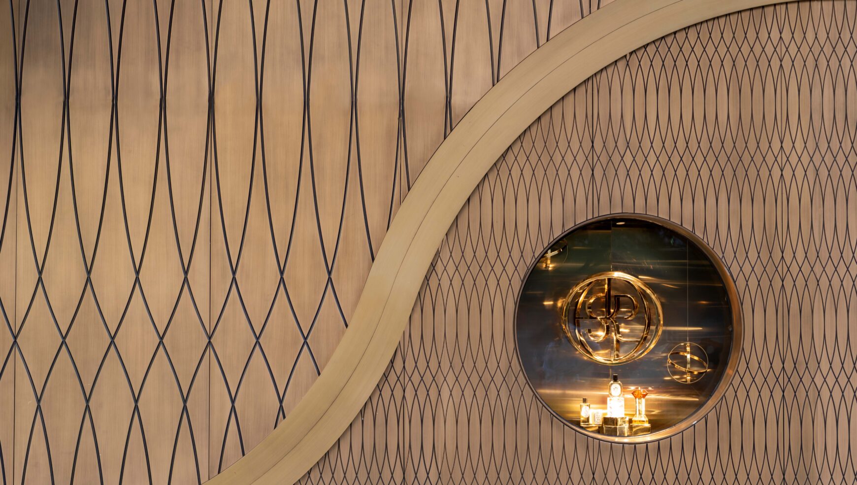
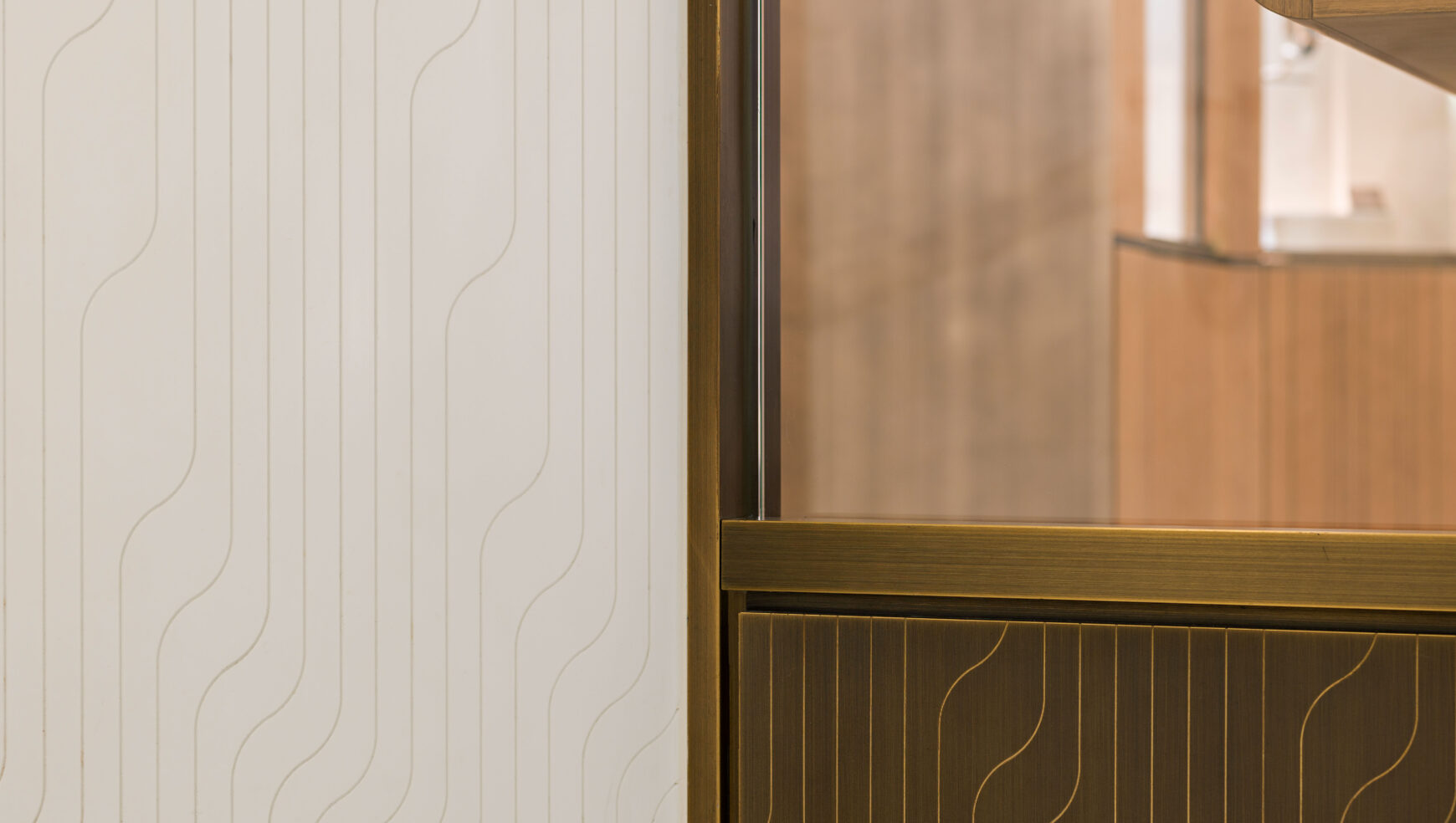
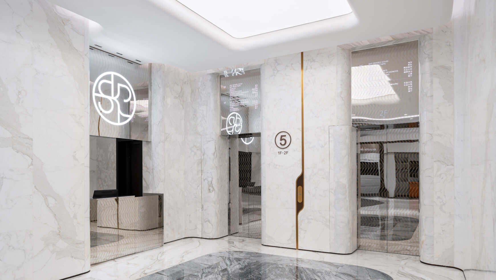
At the centre of this framework was the SKP Curve – composed of two parallel lines connected by tangential curves, this distinctive gesture was conceived as both a branding device and an architectural framework. Embedded throughout each project at multiple scales, it creates a subtle sense of continuity that extends beyond graphics into the physical environment itself.
Its strength lies in its adaptability. While remaining instantly recognisable, the Curve evolves in response to each project, context and customer experience.
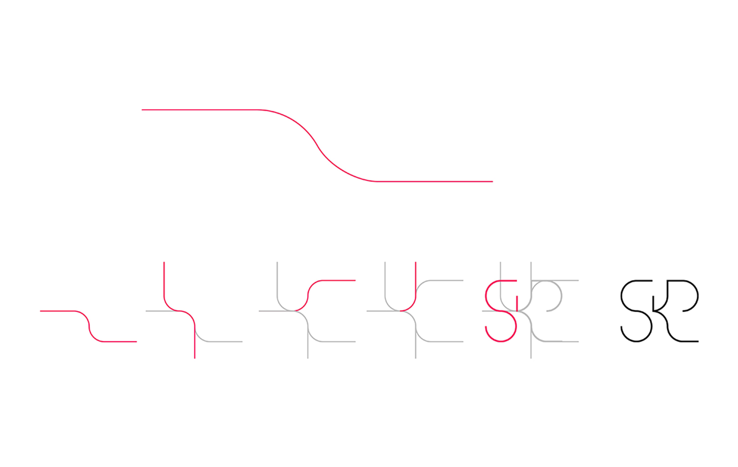
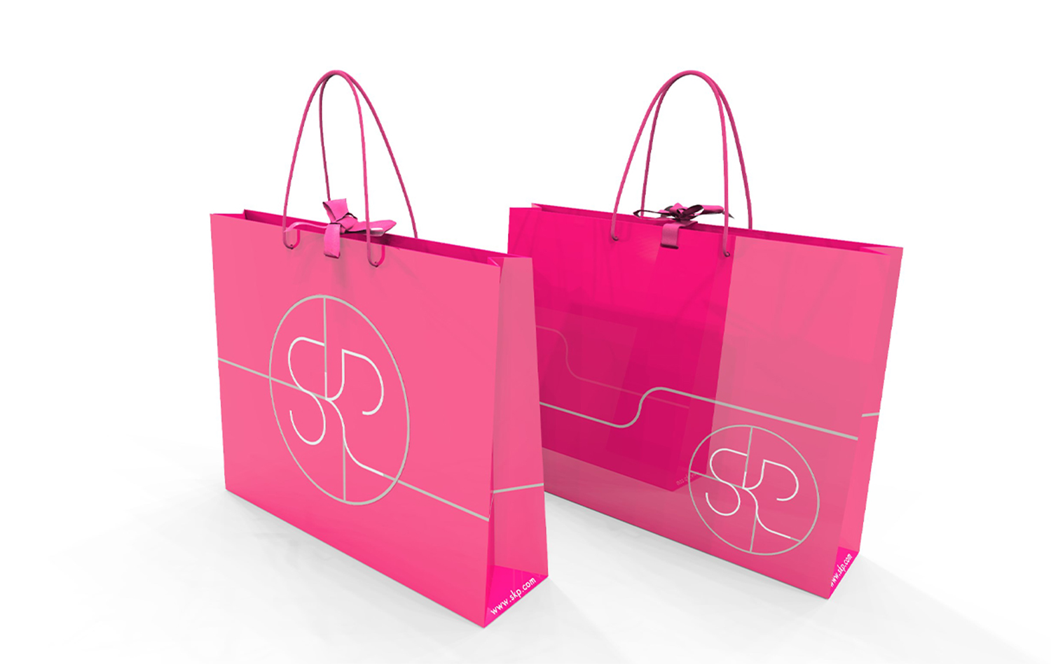
“At the heart of every SKP project lies the SKP Curve. From the lift buttons to the concessions, via the vents built into the pavements outside the building. We made the Curve a subliminal branding cue which artfully reminds visitors that they are experiencing SKP.”
— Torquil McIntosh, Co-Founder, Sybarite
Beijing: The Graphic Foundation
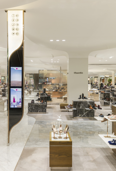
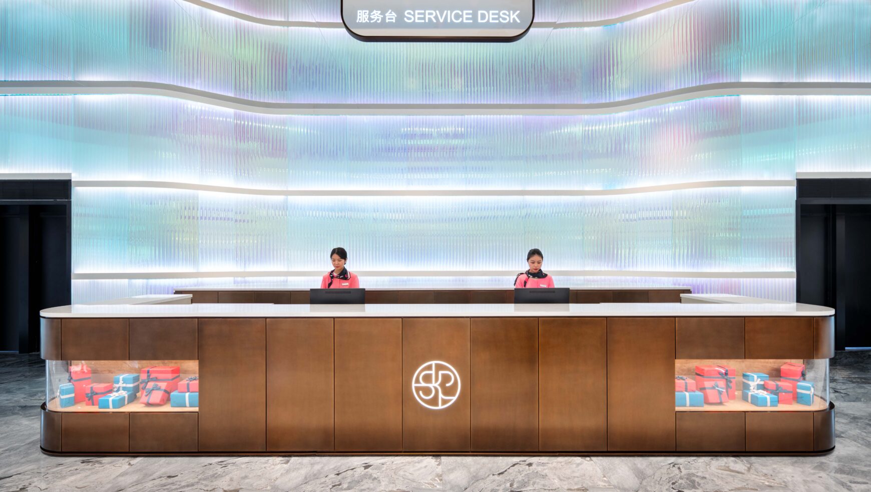
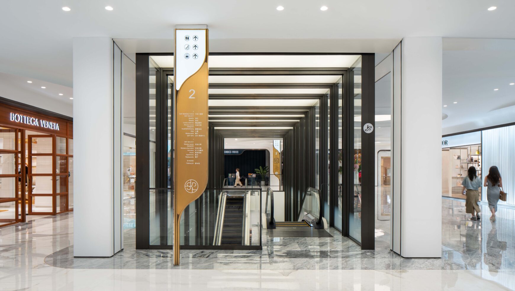
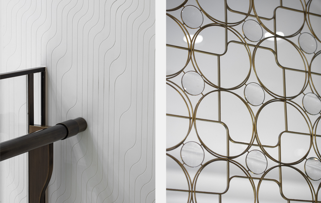
SKP Beijing introduced the first expression of the SKP Curve as a subtle branding and wayfinding language embedded throughout the department store experience. Appearing across packaging, architectural detailing, balustrades and interior finishes, the motif established a cohesive visual identity while allowing the luxury brands themselves to remain centre stage.
The Curve operated as a subliminal design cue, creating familiarity and recognition through repetition and refinement.
Xi’An: The Architectural Skin
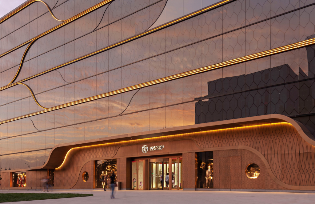
At SKP Xi’an, the Curve expanded from graphic device to architectural language. Integrated into the façade, interior surfaces and circulation routes, the geometry informed the spatial composition of one of the world’s tallest department store buildings, creating continuity across 20 floors of luxury retail.
This evolution strengthened the relationship between brand identity, architecture and customer experience, demonstrating the Curve’s ability to operate from the micro to the macro.
Chengdu: The Landscape Language
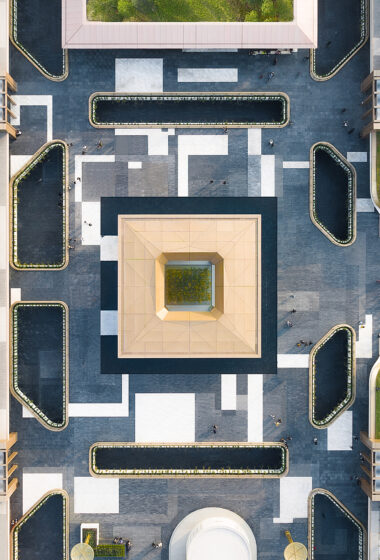
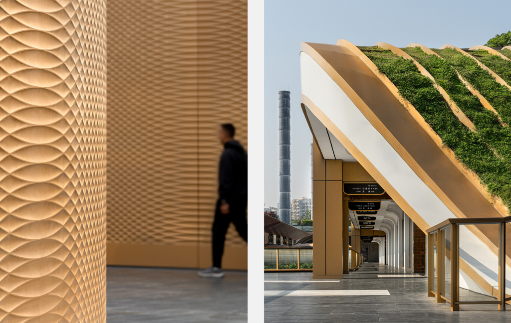
For SKP Chengdu, the Curve extended beyond the building envelope and into the wider masterplan. Embedded throughout the 190-acre SKP Park development, the geometry informed movement, topography and the relationship between landscape, architecture and public realm.
From pathways and landscape features to retail interiors and digital façades, the Curve became a connective thread linking city, park and luxury retail destination into a unified experience.
Wuhan: The Architectural Icon
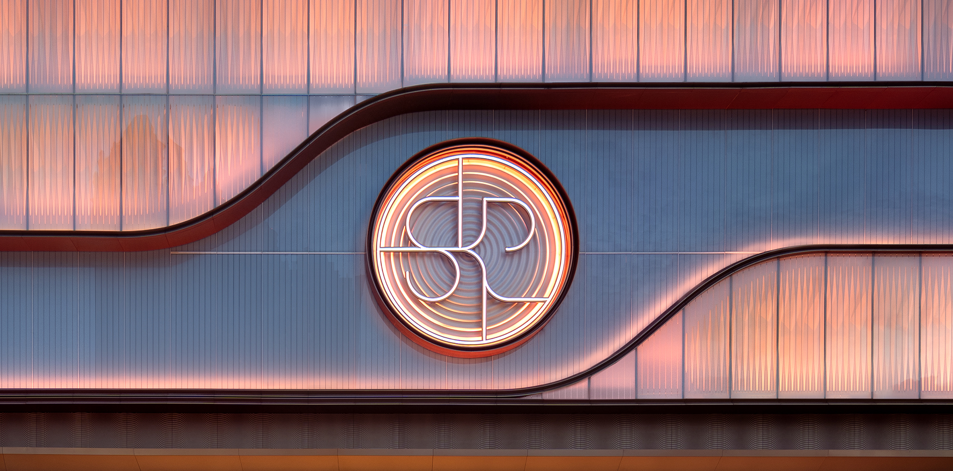
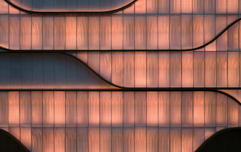
At SKP Wuhan, the Curve reaches its most expressive built form. Scaled up to shape the illuminated moiré façade and key arrival moments, it establishes a powerful civic identity while reinforcing the department store’s presence within the city.
What began as a subtle graphic motif in Beijing evolved into a defining architectural signature — demonstrating the flexibility and longevity of the SKP design framework.
Conclusion
From a single geometric gesture, Sybarite established a scalable retail identity capable of operating across branding, architecture, wayfinding, landscape and customer experience. More than a logo or visual motif, the SKP Curve has become the foundation of an evolving design language that continues to shape each new SKP destination.
As the partnership between Sybarite and SKP enters its second decade, the Curve remains both constant and adaptable — a defining thread connecting one of the world’s most successful luxury department store portfolios.