21.11.2018
The Sybarite Report 2018 – Designing the Data
Our report was published in collaboration with GlobalData, who supplied us with expert qualitative and quantitative data.
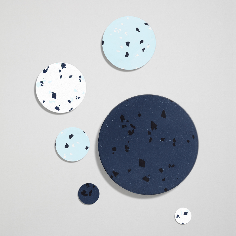
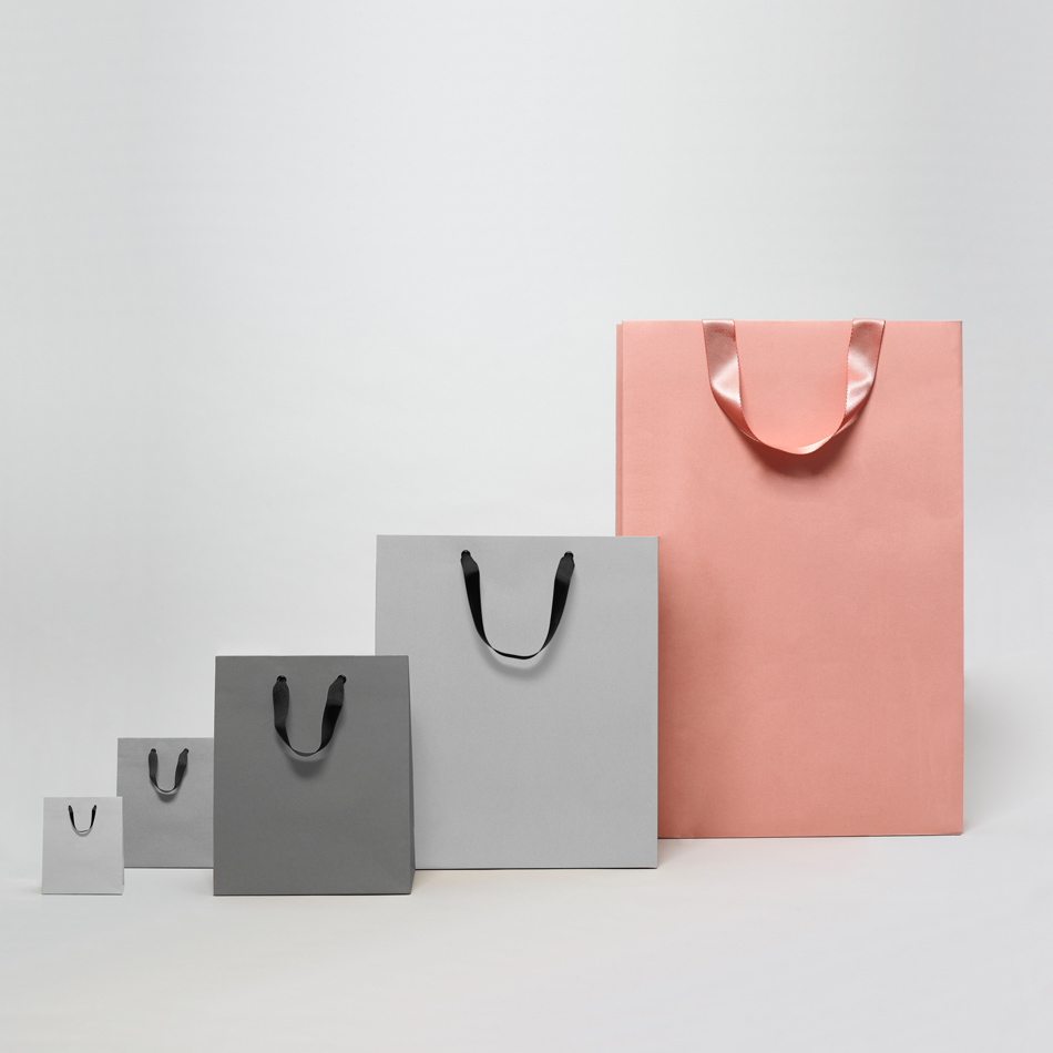
As a studio of creatives being faced with multiple Excel spreadsheets, we wanted to create something a bit more interesting than bar and pie charts.
So, we worked with Sarah Miller and & Partners and TM to produce 3D infographics, using architectural materials cut to scale and then photographed.
![](https://sybarite.com/wp-content/uploads/2018/11/News_2018_The-Sybarite-Report-2018-how-to-make-data-look-beautiful_1.jpg)
![](https://sybarite.com/wp-content/uploads/2018/11/News_2018_The-Sybarite-Report-2018-how-to-make-data-look-beautiful_2.jpg)
![](https://sybarite.com/wp-content/uploads/2018/11/News_2018_The-Sybarite-Report-2018-how-to-make-data-look-beautiful_3.jpg)
![](https://sybarite.com/wp-content/uploads/2018/11/News_2018_The-Sybarite-Report-2018-how-to-make-data-look-beautiful_4.jpg)
![](https://sybarite.com/wp-content/uploads/2018/11/News_2018_The-Sybarite-Report-2018-how-to-make-data-look-beautiful_5.jpg)