SKP Branding
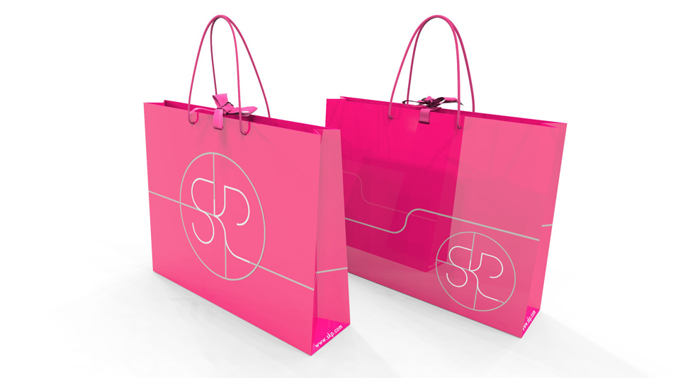
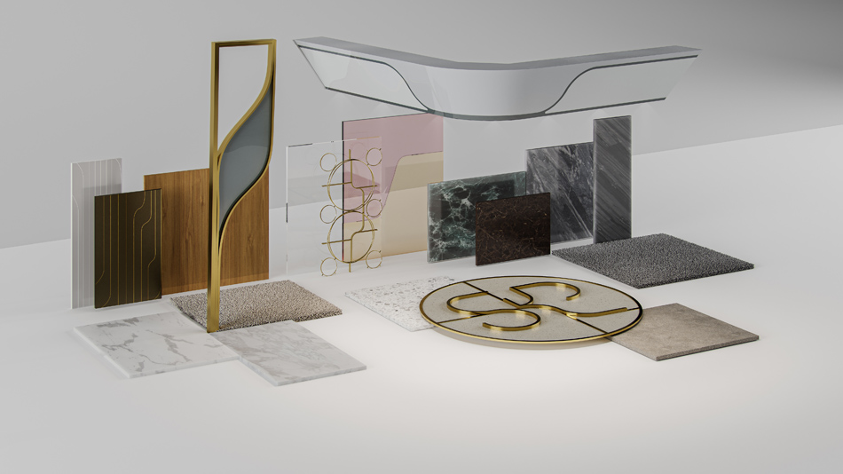
Having won a prestigious private competition, Sybarite began their journey as architectural partners to leading retail operators SKP. The initial brief was to evolve the then 140,000m2; Shin Kong Place from a mall into a luxury department store. Sybarite approached this holistically. In 2016 SKP Beijing launched its brand-new identity, wayfinding iconography, graphics, signature pink packaging and logo derived from the Chinese character for rice. In 2018, this was exponentially carried through at SKP Xi’an.
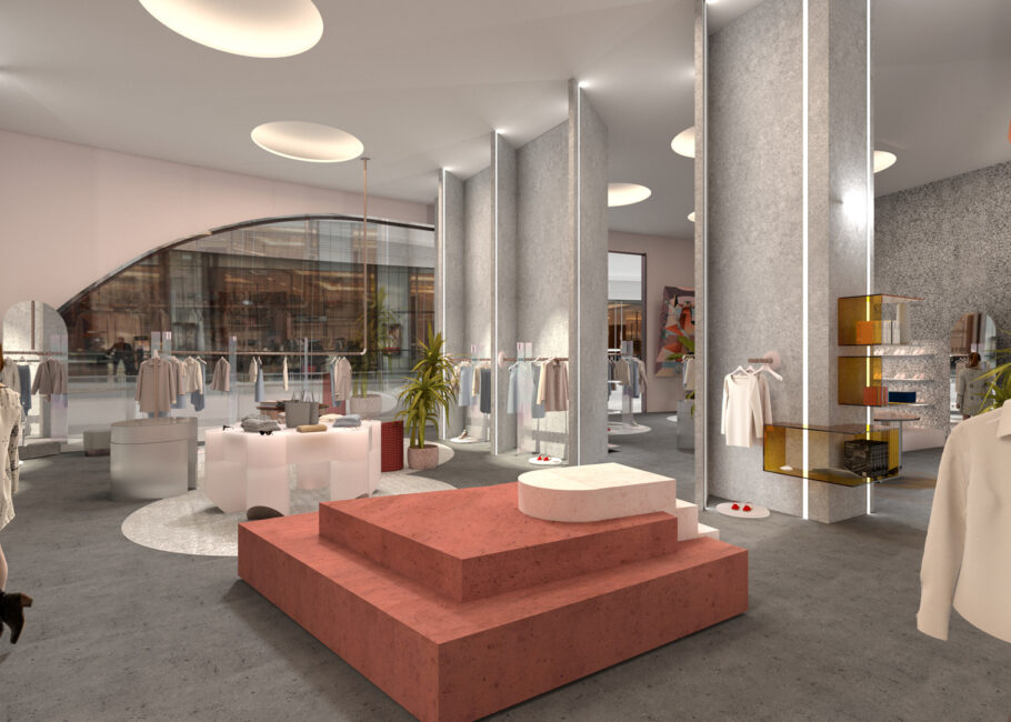
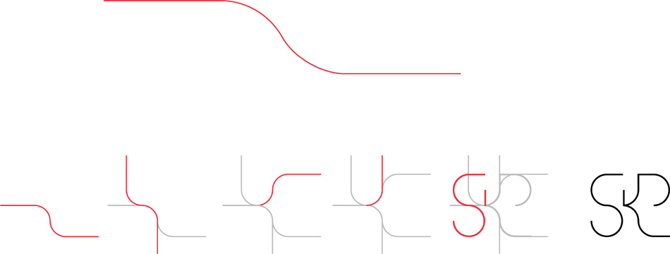
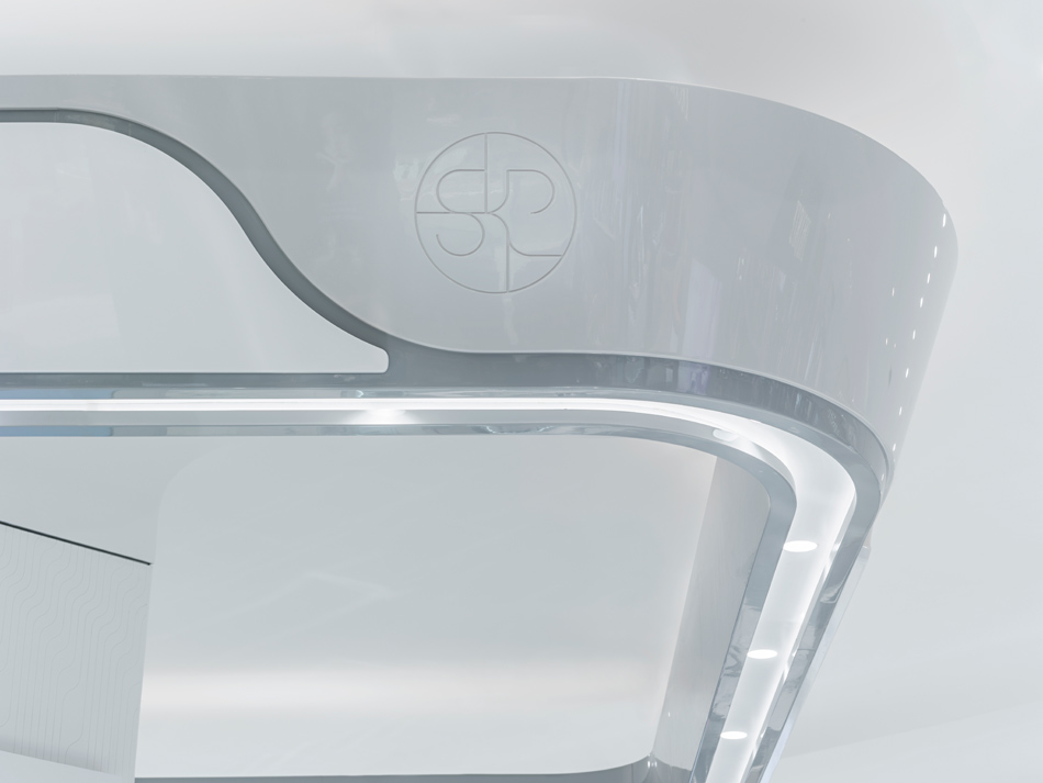
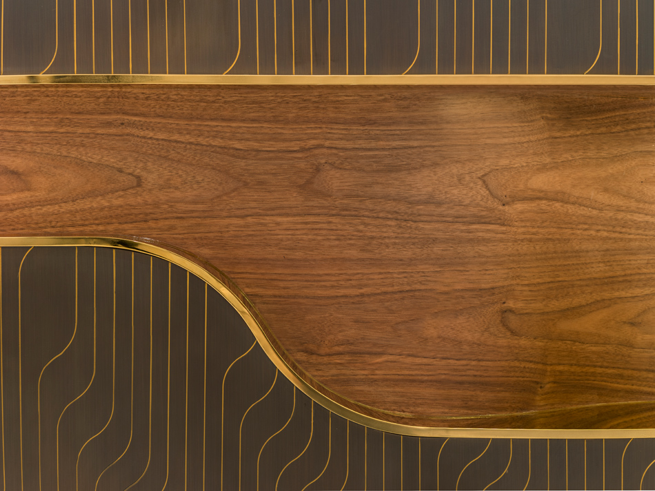
Architecturally, the SKP curve was created to become synonymous with SKP department stores, to give a sense of place and create heritage. The curve – two parallel lines linked by two tangential curves – is the recognisable element that ties the exterior to the interior, a subliminal and artful message that you are within a branded, recognised SKP environment but without overpowering the brands.
In 2019, SKP-S, further evolved the brand and identity of SKP into an experiential luxury department whist retaining the familiar SKP language and vocabulary of previous stores. The SKP brand evolution continues apace with forthcoming stores in the future.
Services
Branding + Full Architectural Design Services
Client
SKP
Appointment
2017
Location
China
Photography
Kristen Pelou, Sybarite
Services
Branding + Full Architectural Design Services
Client
SKP
Appointment
2017
Location
China
Photography
Kristen Pelou, Sybarite