S.T. Dupont
The new concept for S.T. Dupont stores originates from the Maison’s first iconic lighter of 1941 – an innovation of its time capturing elegance, functionality, sophistication, and balance. A legendary emblem that captures the spirit of their heritage, it has been reimagined in continuum to the present day in a range of luxury materials, capturing their exclusive diamond pattern, graphic linearity, and lacquering technique.
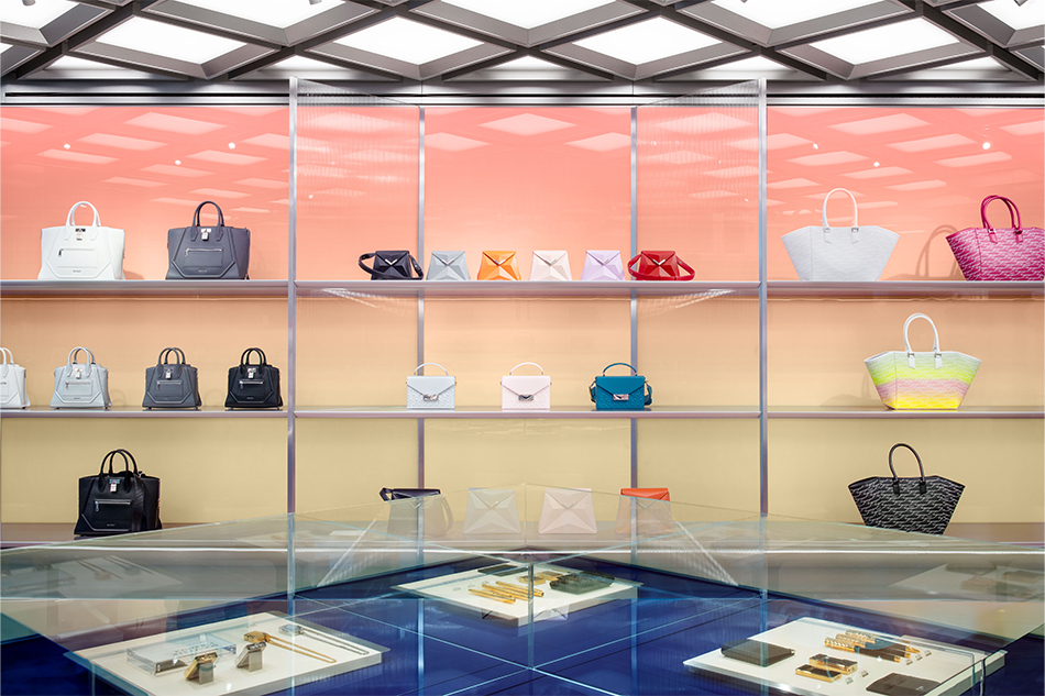
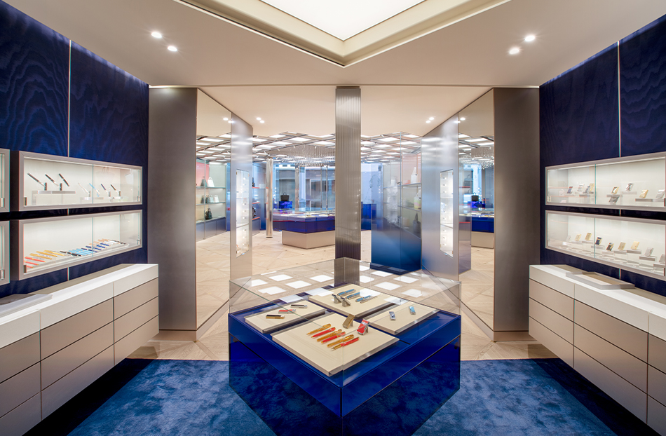
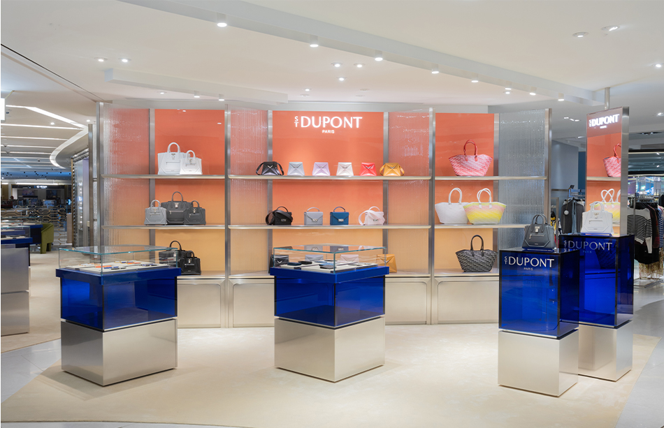
The driving influence of the diamond pattern is translated in design codes and spatial configurations throughout the store. In conjunction with that are the tonal gradient colourways derived from their unique dual flame system – multidimensional shades from electric blue through to navy and soft peach transitioning to glowing yellow.
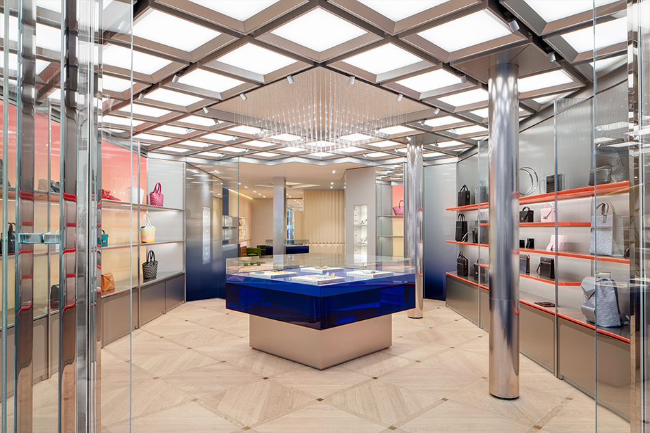
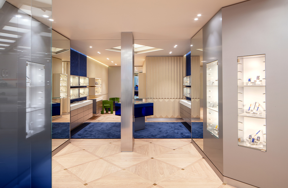
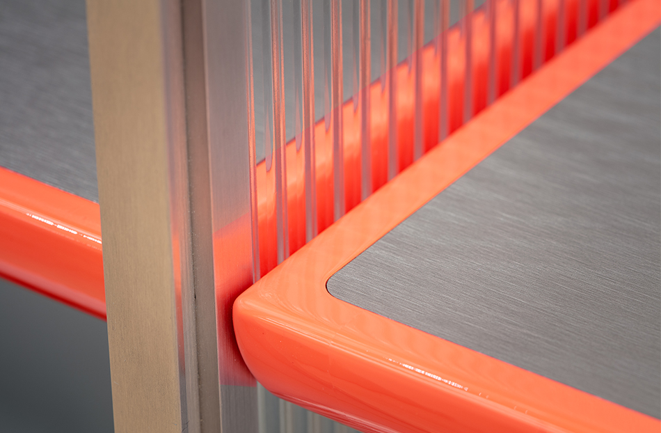
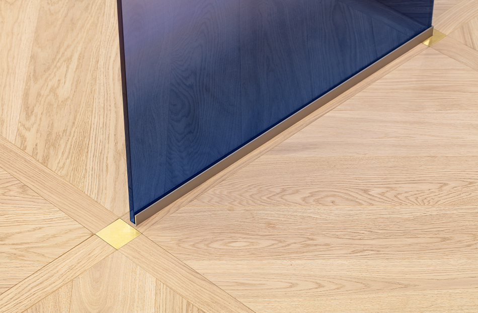
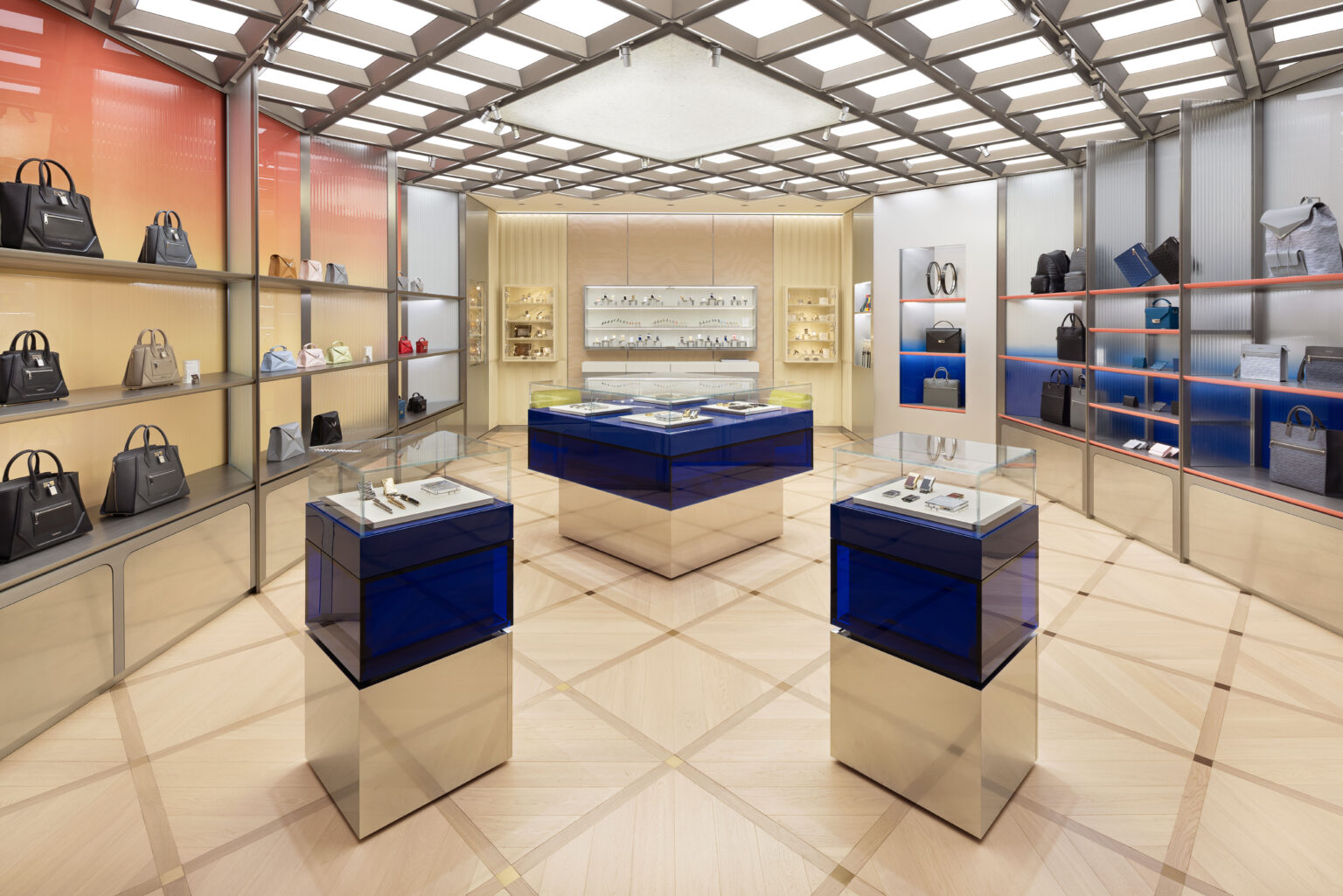
The arrival sets the tone for the retail experience with the exterior framed by a distinguished façade that features the foundations of the S.T. Dupont brand. Here pillars are cladded in reeded stainless-steel columns: a nod to the levers of the lighter itself, high gloss blue lacquered signage recalls their applied mastery of the material, and high gloss acrylic flag signage studded with metallic diamond tiles crafted in ceramic anchors the corners – the quintessential shape of ST Dupont. The front window areas are imbued by the signature blue colour and are screened off from the rest of the store with the use of glass V-shaped screens of blue ombre effect – solid at the foundation fading to transparent to enable a clear and seductive sight line in. Through which, the store opens up to reveal a reeded metal coffered ceiling and a centralised chandelier in the form of a diamond shape comprised of glass fibre rods, an enlivened shower of flaming light that hangs in perfect symmetry with the entrance. The ceiling and the floor are in dialogue with each other in their 45-degree mirrored gridded square modulated form – the diamond motif informed the module for the plan itself.
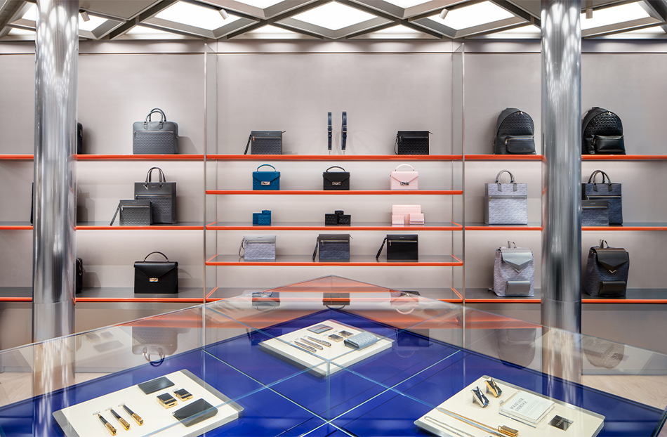
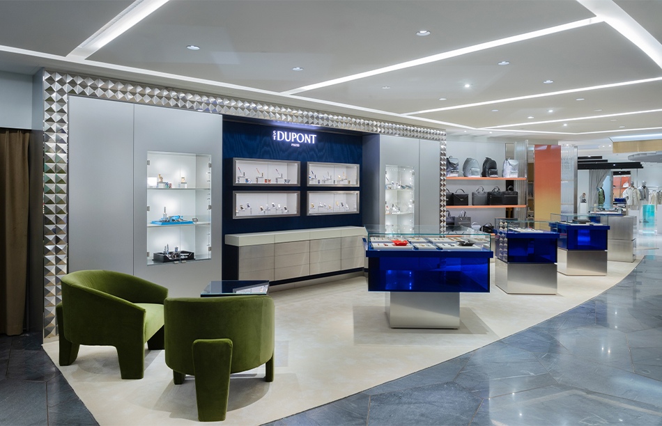
Painstaking efforts have been taken to ensure that the customer journey is perfectly paced and proportioned and aligned to the moments of pause, each square module measuring the average walking stride length for instance and the placement of materials connecting with a sense of balance to the goods on display, commencing with hard finishes at the front of the store where the leather goods are displayed progressing to soft finishes juxtaposing with hard goods such as lighters, pens and smoking accessories and finally arriving in a private ‘haute couture’ niche.
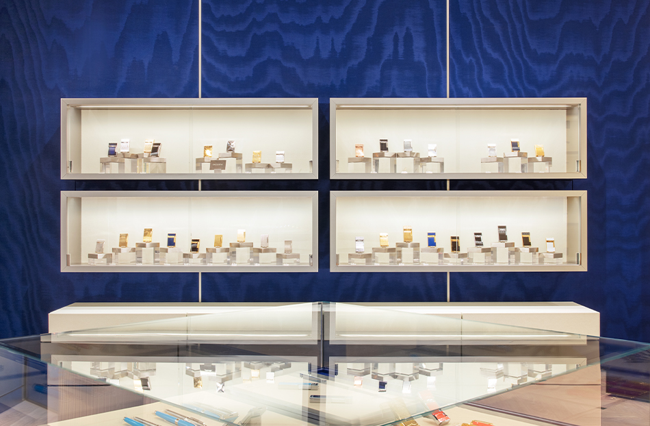
An upscale mix of materials and their applications: white leather, 3-d ivory Alcantara panelling, blue Moiré, satin silver lacquer, brushed and reflective metals, gradient acrylic, and glass effects have been chosen for their sense of subtle colour saturation, luxurious sumptuousness, dextrous tactility, and inherent and engraved patterning.
A bespoke and adaptable ‘kit of parts’ of cabinetry and displays have been designed for the store, to synchronise and unify with the design language and its gesture and form – a combination of integrated vignettes and shelves and loose vitrine tables. The store is grounded by a timber floor which is book matched into square modules, a natural yet constructed modern take that is reminiscent of French royal palaces of the past with accents of brushed brass inlays which will capture the patination of time.
The 90 m2 Parisian flagship is heavily coded by balanced with distinctive vignettes and sets the tone for future sites and agile iterations. It creates a vision which is bold and modern.
In 2025, S.T. Dupont opened a flagship store in Ginza, the heart of Tokyo’s prestigious luxury district. The 60m2 store is a continuation of established heritage design codes, whilst infusing delicate moments of Japanese locality and craft.
“The new store design for S.T. Dupont is a study of the balance between the timelessness of the classic and the vibrancy of the pioneering and innovative spirit to derive at a refreshed and composed and coherent backdrop in perfect calibration for the future face of S.T. Dupont. Created to craft a new kind of legacy”. – Simon Mitchell, Co-Founder, Sybarite
Services
Interior Design + Interior Architecture
Client
S.T. Dupont
Appointment
2023
Typologies
Flagship, Shop-in-Shop
Area
50m2-90 m2
Location
Paris, Hong Kong
Photography
Courtesy of S.T. Dupont & Dylan Thomas

Services
Interior Design + Interior Architecture
Client
S.T. Dupont
Appointment
2023
Typologies
Flagship, Shop-in-Shop
Area
50m2-90 m2
Location
Paris, Hong Kong
Photography
Courtesy of S.T. Dupont & Dylan Thomas


