SKP Beijing
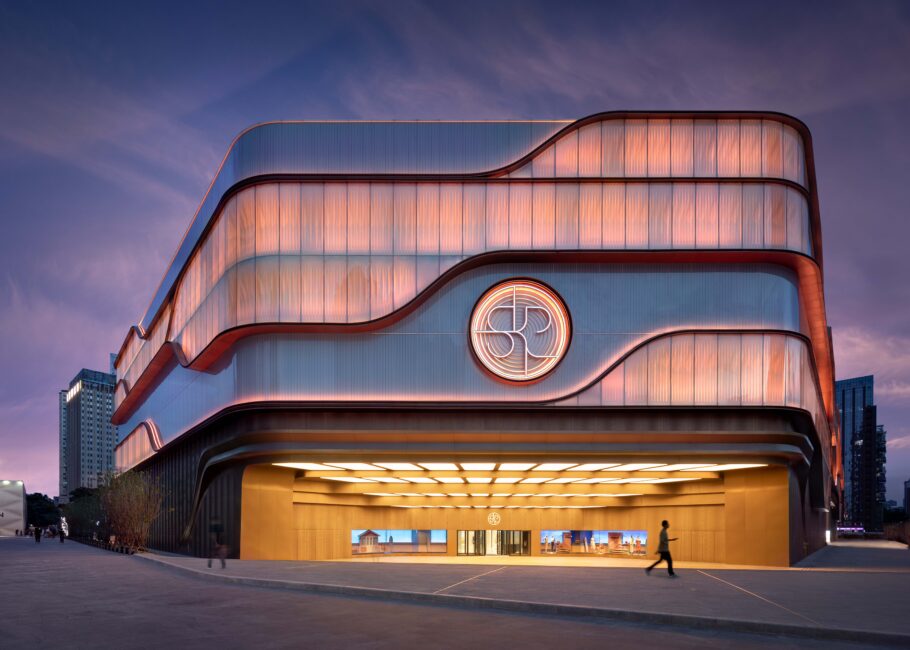
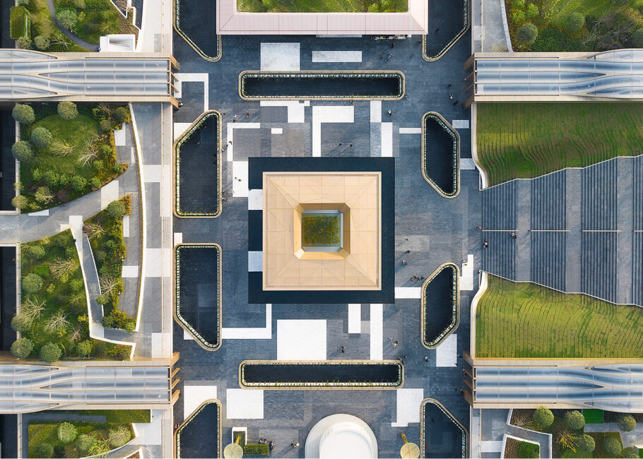
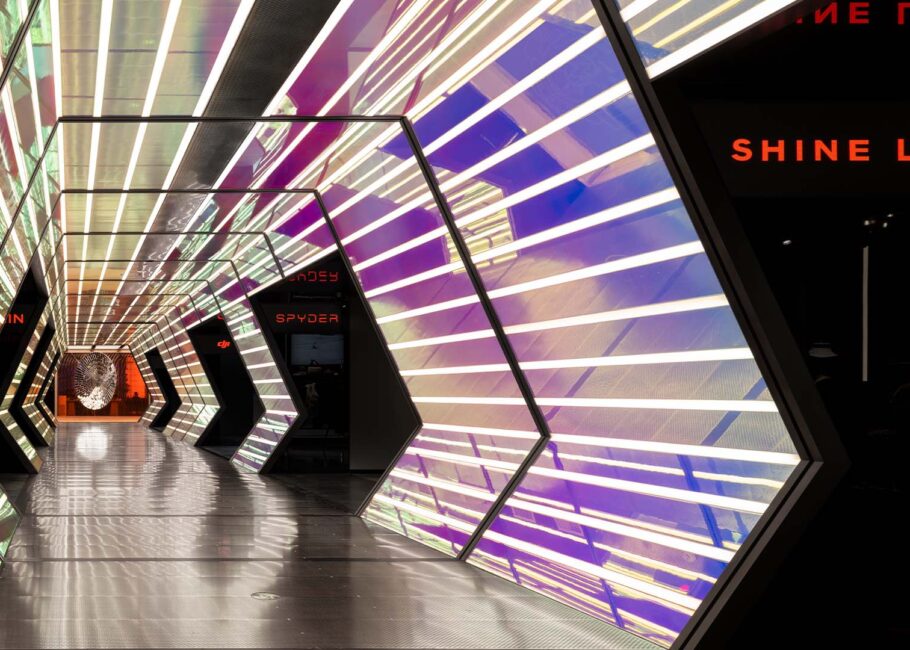
Having won a prestigious private competition, Sybarite began their journey as architectural partners to leading retail operators SKP. The initial brief was to evolve the then 140,000m2 Shin Kong Place from a mall into a luxury department store. In 2016 it launched as SKP with a brand-new identity from wayfinding iconography, graphics, signature pink packaging and logo derived from the Chinese character for rice.
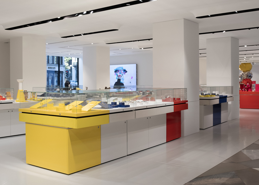
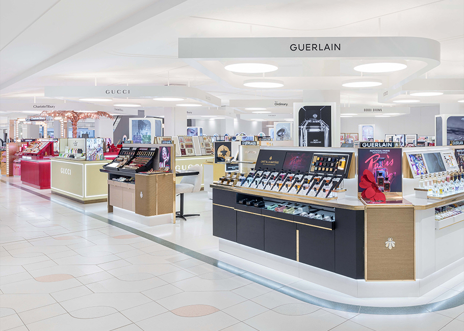
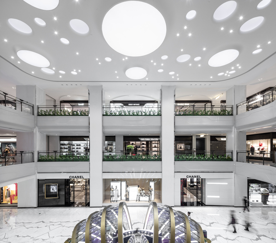
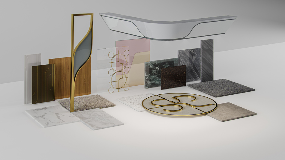
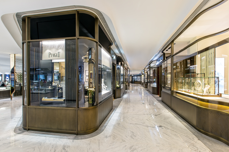
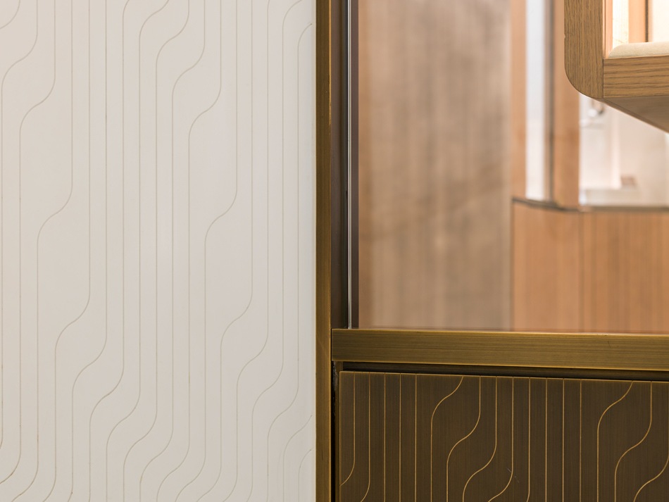
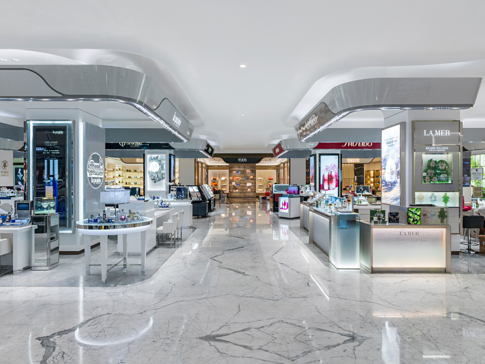
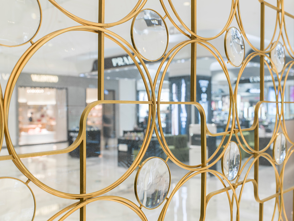
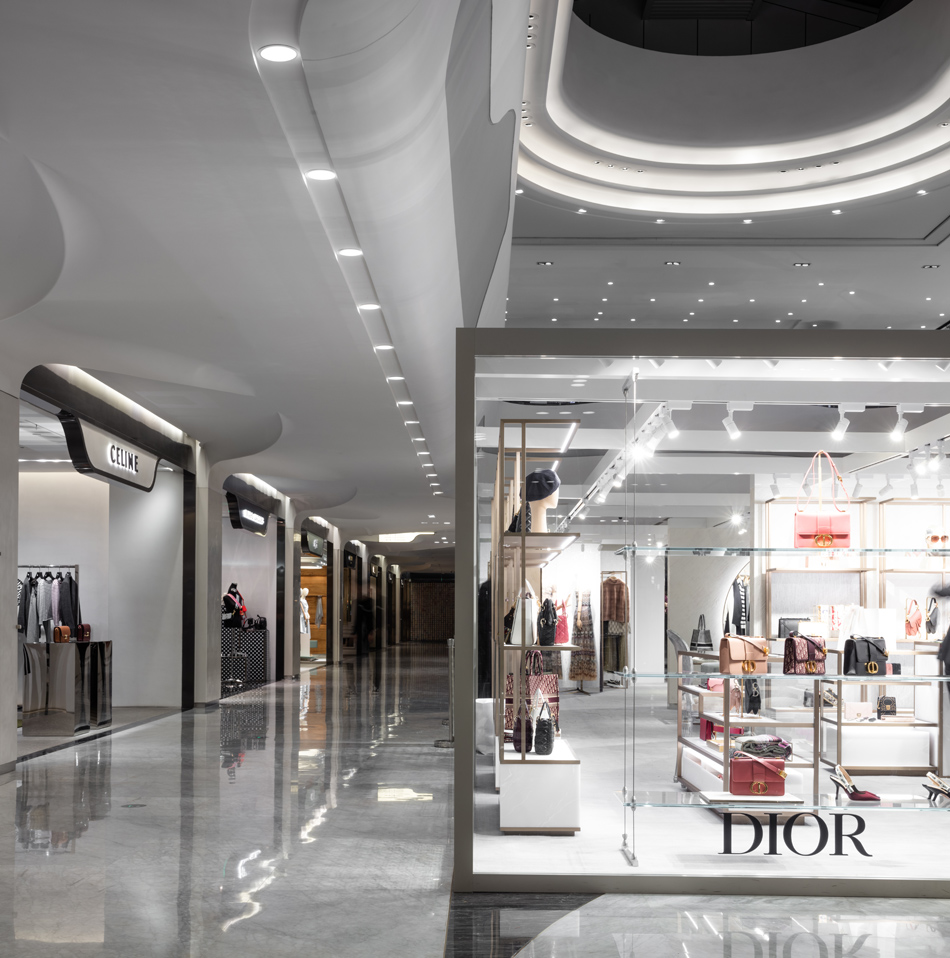
Architecturally, the SKP curve was created to become synonymous with SKP department stores, to give a sense of place and create heritage. The curve – two parallel lines linked by two tangential curves – is the recognisable element that ties the exterior to the interior, a subliminal and artful message that you are within a branded, recognised SKP environment but without overpowering the brands. The elevated and sophisticated mix of materials – from marble to brushed metallics, carved Corian and shades of terrazzo – is very much in line with the benchmark brands that are housed under its roof.
SKP Beijing is ranked as No 1 in Asia and No 2 globally – Sybarite’s holistic transformation has brought the luxury department store firmly on to the world stage.
Services
Full Retail Design Services
Photography
Edmon Leong, Kristen Pelou
Client
SKP
Appointment
2013+
Area
140,000m2
Location
Beijing, China
Services
Full Retail Design Services
Photography
Edmon Leong, Kristen Pelou
Client
SKP
Appointment
2013+
Area
140,000m2
Location
Beijing, China


